
Intro
2/3 users never finished the onboarding journey. I found out why and shipped a targeted solution
TwinMind is an AI memory app with 350K+ users. Its value only becomes real once you record your first session, which makes onboarding a critical experience. I diagnosed the drop-off, led the design decisions, and partnered with engineering across two release cycles to ship and measure the changes.
- Role
- Product Designer
- Duration
- 4 Weeks
- Team
- 1 Designer (me) 2 Developers 1 Analyst
- Skills
- Data Analysis Interaction Design Prototyping
Impact
Sign up to 1st session conversion doubled, going from 33% to 60%. 1st to 5th session conversion improved by 4% overall
At a Glance
Targeted cuts, resequenced trust signals, and one recovery path that removed extra clicks and reduced time to value
Discovery
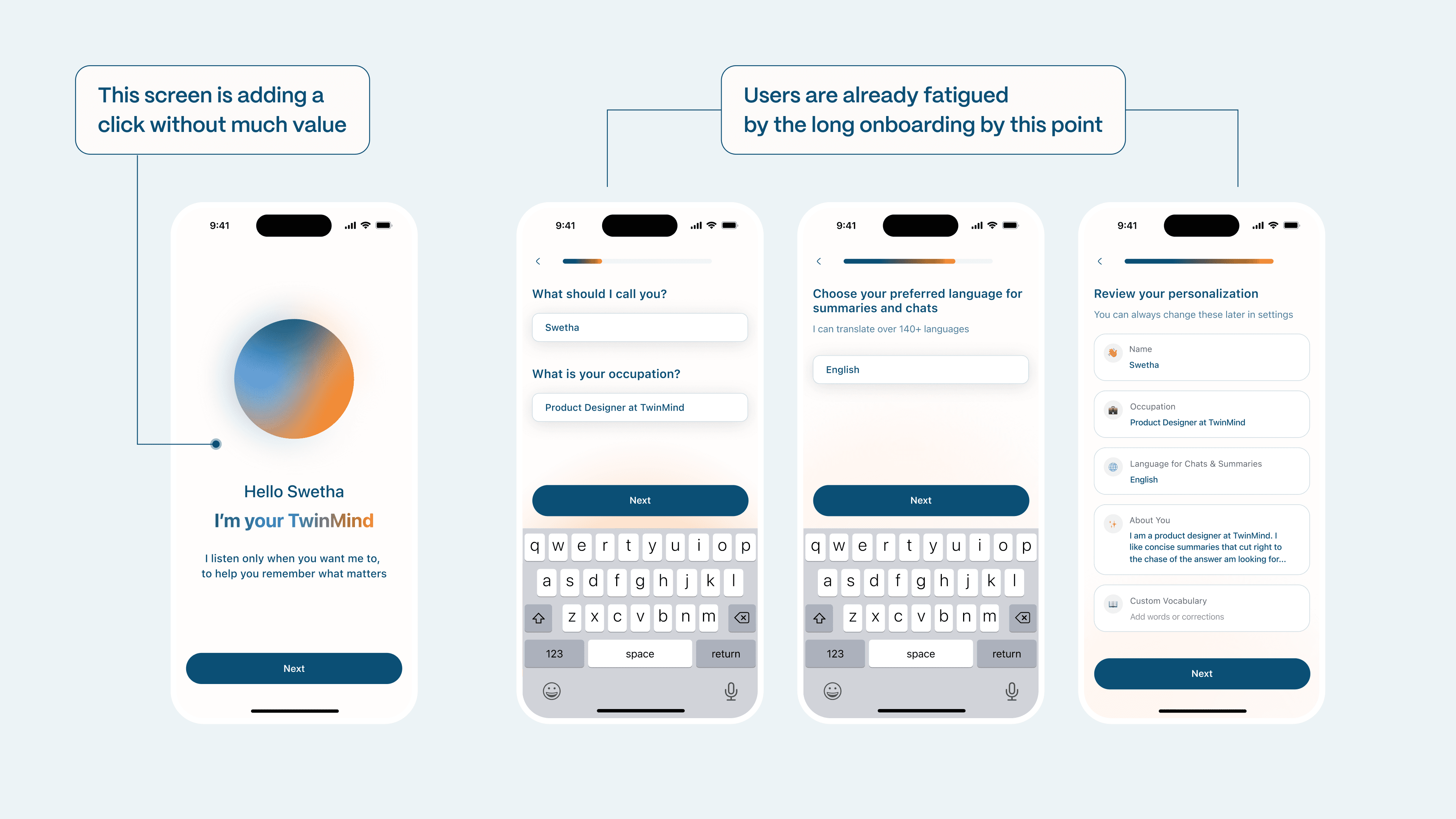
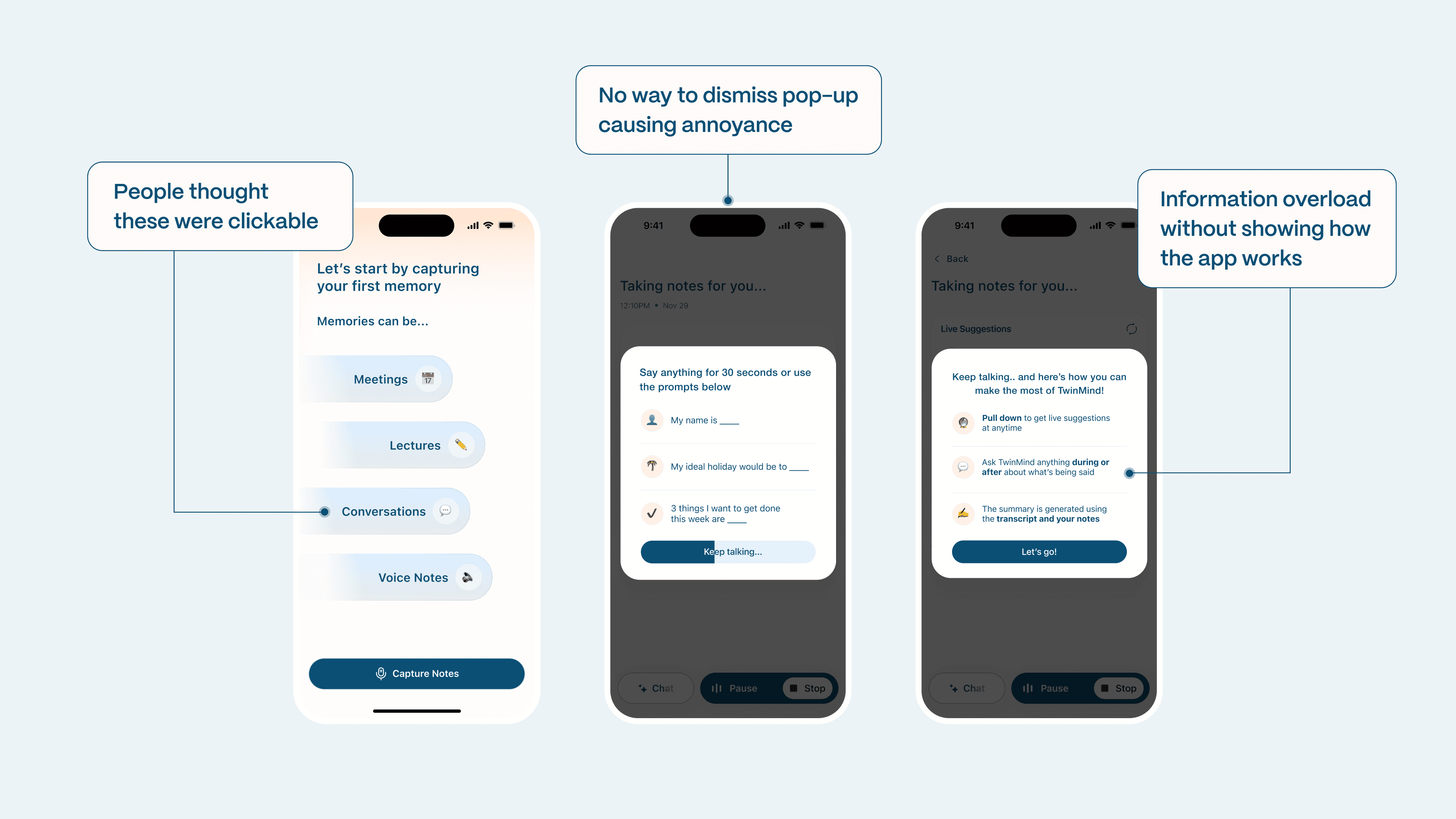
I pulled the Amplitude data and clicked through the product on iOS and Android to investigate drop-offs
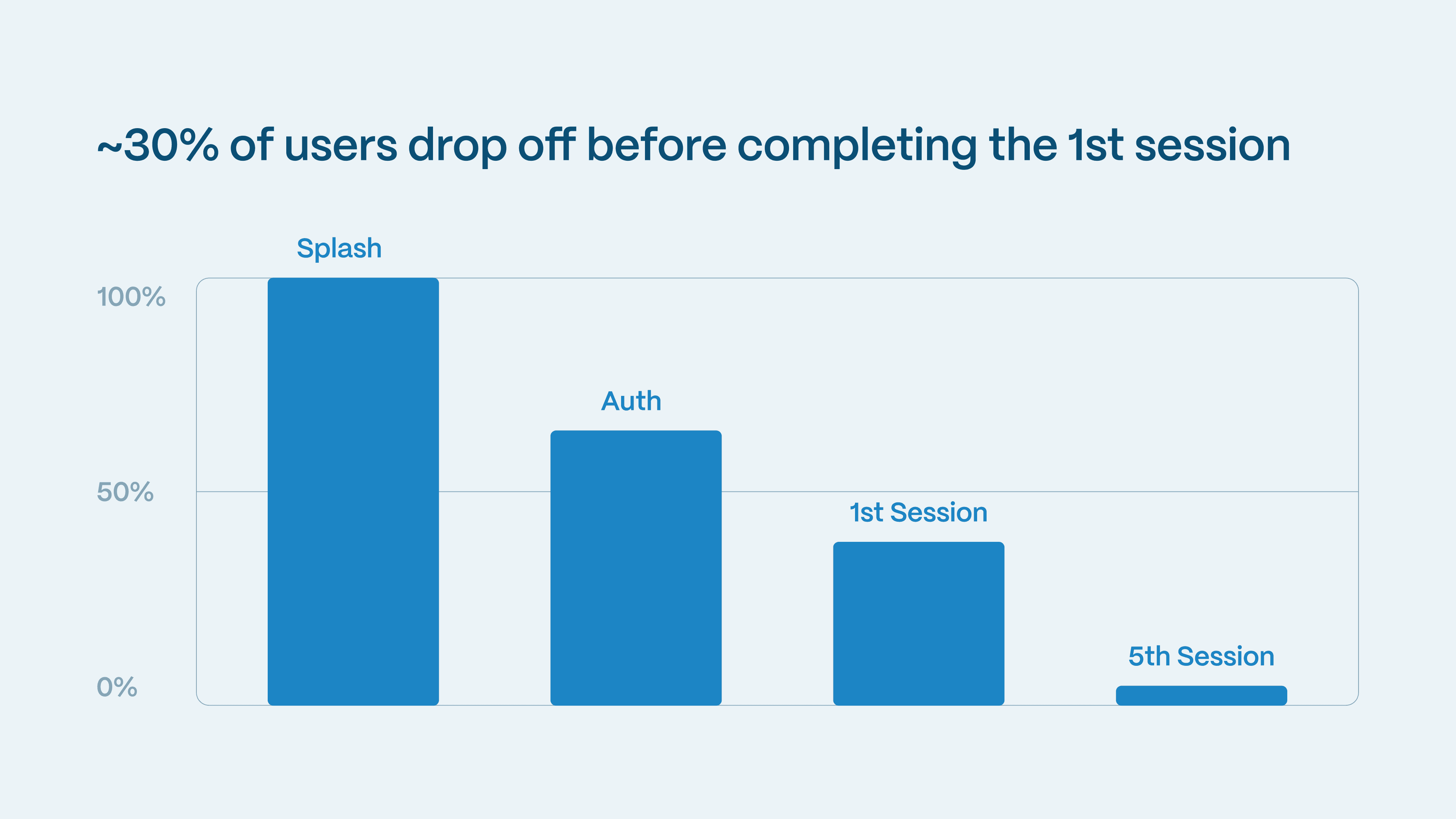
Users were fatigued by unnecessary clicks leading to drop-offs. The fastest win was cutting friction from the flow
Each confusing screen was bleeding 1-3% of users. The overall flow also had gaps in its logic.
Solution
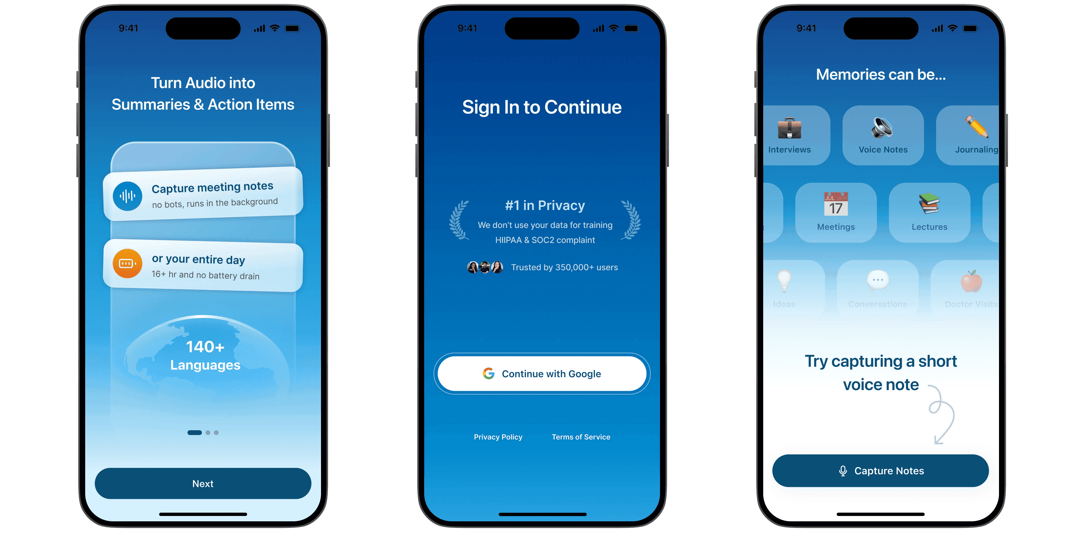
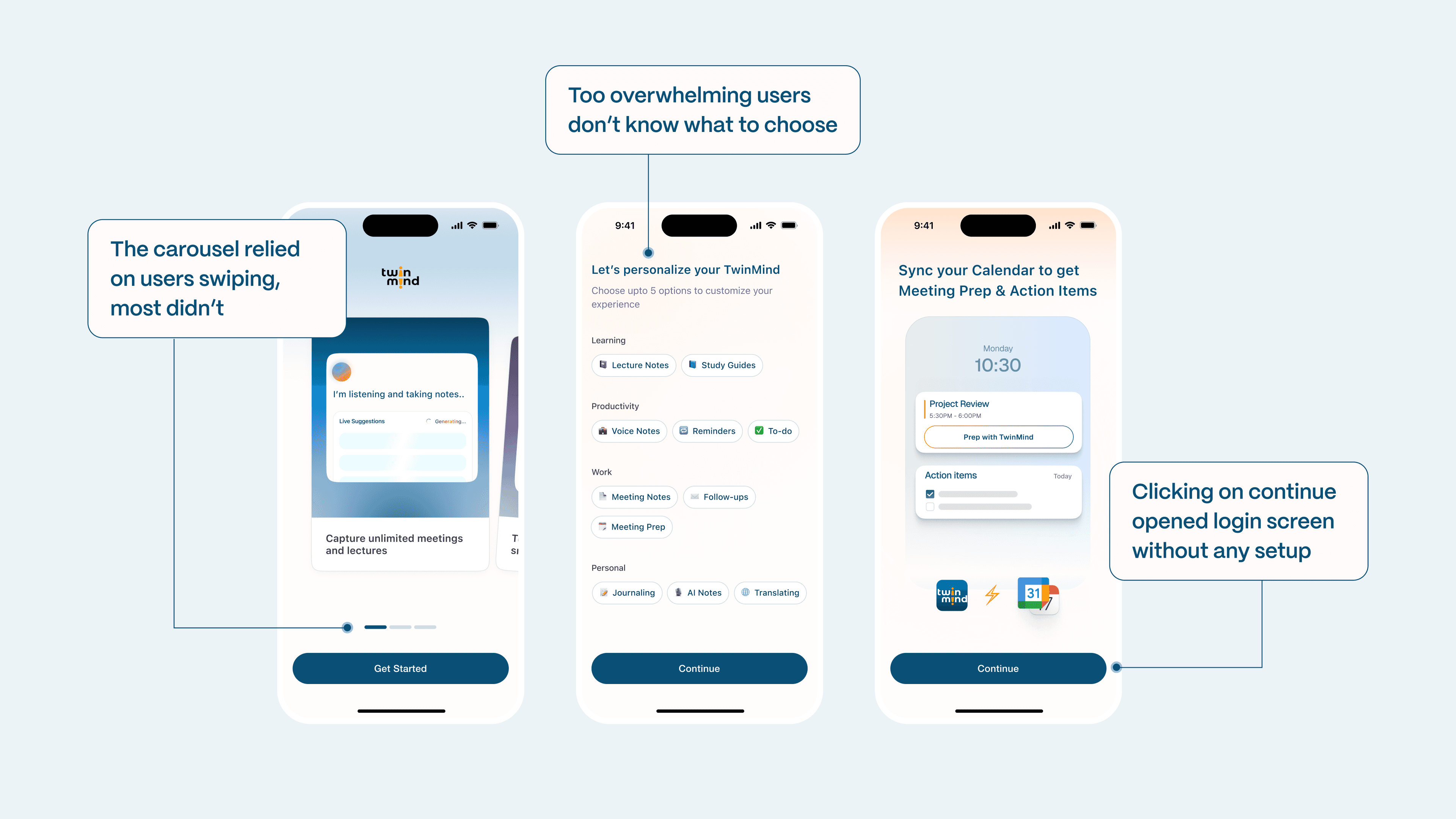
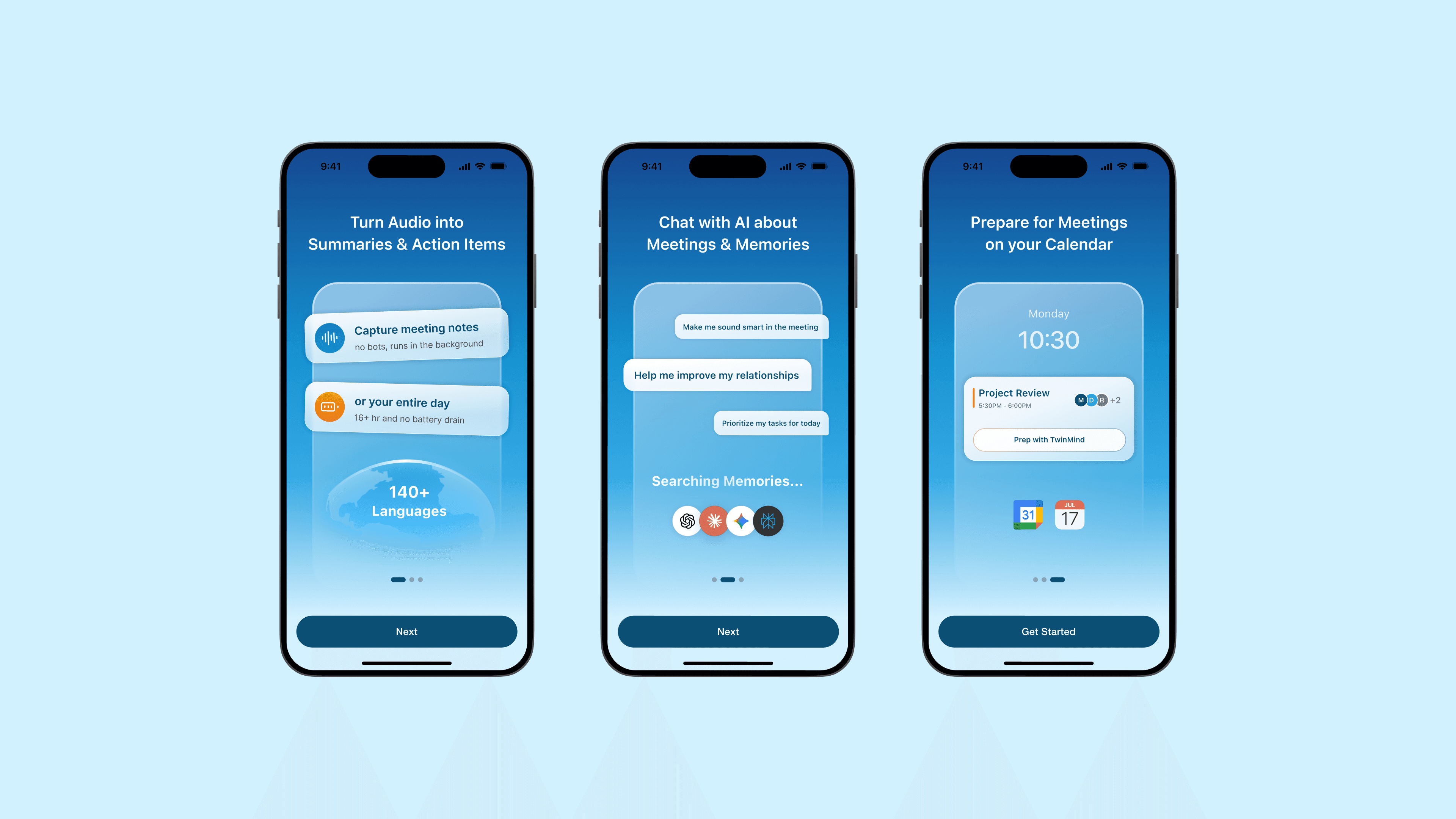
I broke the intro carousel into three standalone screens, building the case for calendar and notification access
Most users swiped past the carousel without reading it. Three separate screens, each requiring a click, fixed that.
I condensed the flow and redesigned the moments that were losing users
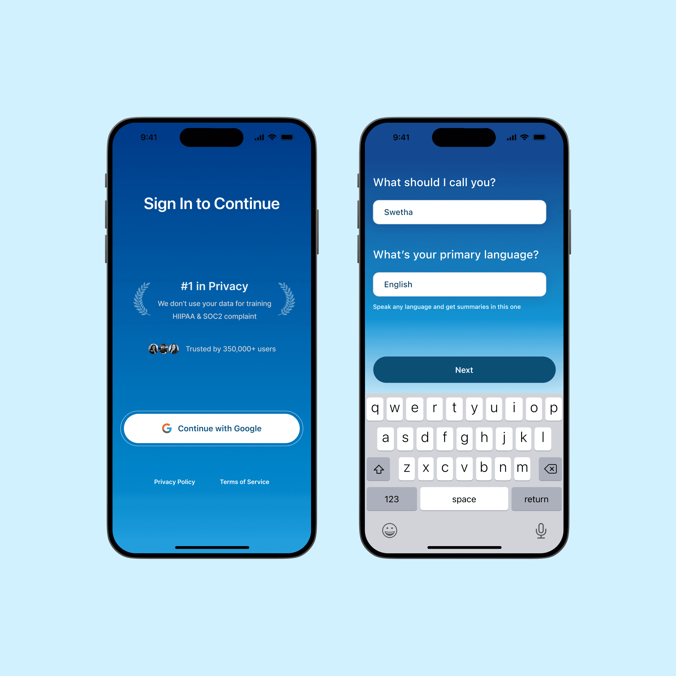
Sign Up Screen + Language
Trust signals added to the login screen, personalization condensed from 6 screens to one.
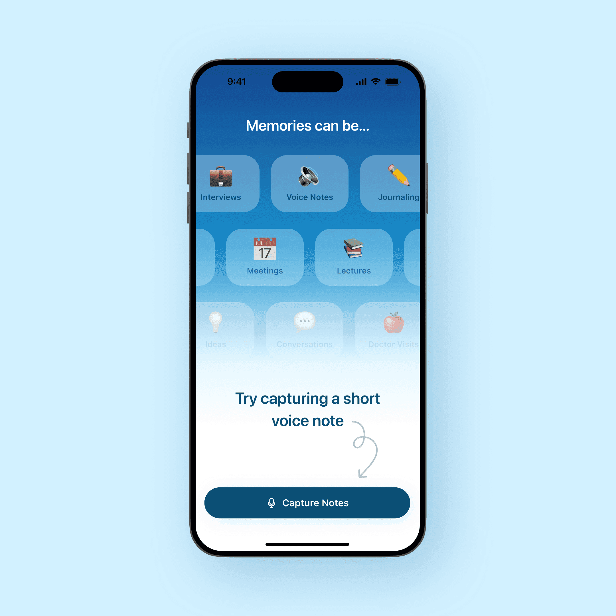
Capture 1st Memory
Redesigned the visual so the icons don't feel tappable. The speaking prompt is dismissible — users who weren't ready to talk could skip it.
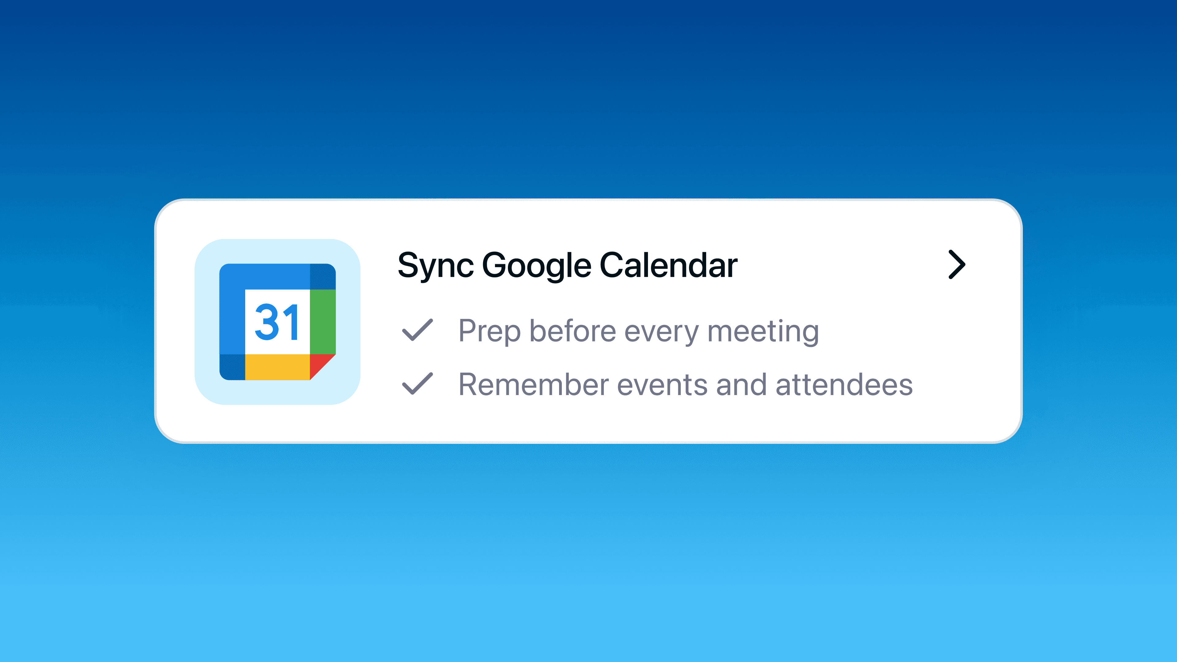
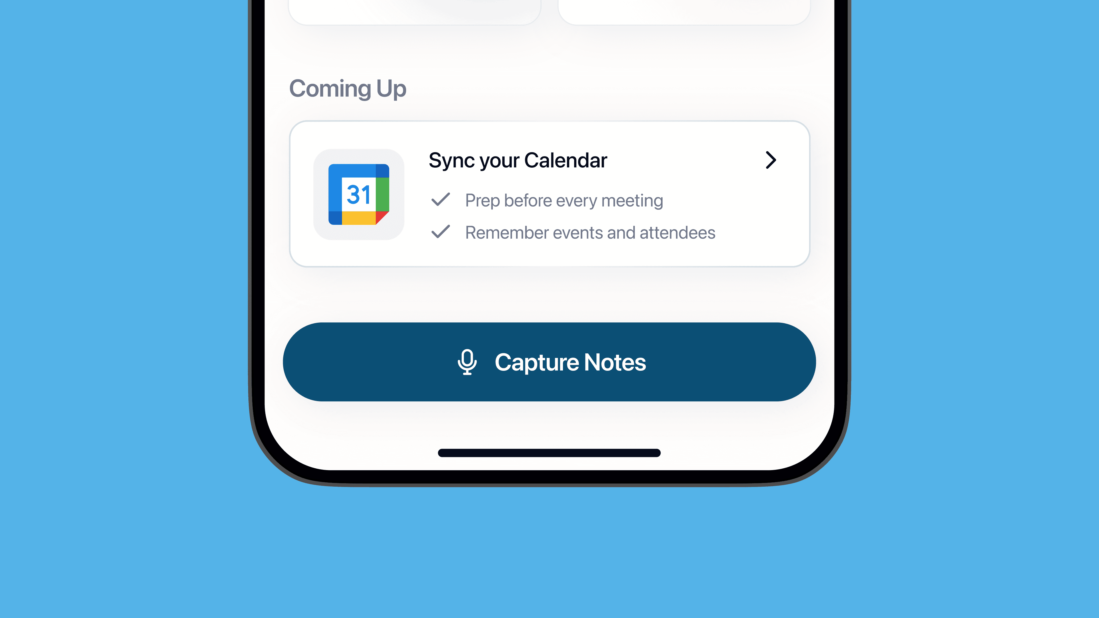
For users who declined calendar access during sign in, a nudge on the home screen gave them a second chance
Once the product had earned some trust, the home screen gave them another chance to connect their calendar.
Reflection
I learned how to be resourceful by using the data we had available to uncover concrete pain points
The data showed me where users were dropping. Clicking through the product myself showed me why. Those two things together gave me the confidence to cut screens that had real reasons behind them, and add trust signals where they'd actually land.